Designing a crypto wallet that works for beginners and traders alike
The brief was straightforward on the surface: design a Web3 wallet that works for everyone. In practice, that meant solving two very different problems at once. New users needed an experience gentle enough to get them past the learning curve without dumbing anything down. Experienced traders needed depth, speed, and control. We ran global UX research with 1,600 participants across both groups, mapped where each type of user broke down, and rebuilt the product experience around those findings.
Six decisions that shaped a better wallet
Onboarding That Keeps People Around
Research with 1,600 users across three experience levels revealed a consistent problem: new users hit unfamiliar terminology and disappeared. We redesigned the entire onboarding sequence with plain language, a visual balance overview that gave users immediate orientation, and contextual tips that appeared at the right moments. The goal was to get someone from zero to confident in a single session, and the retention numbers showed it worked.
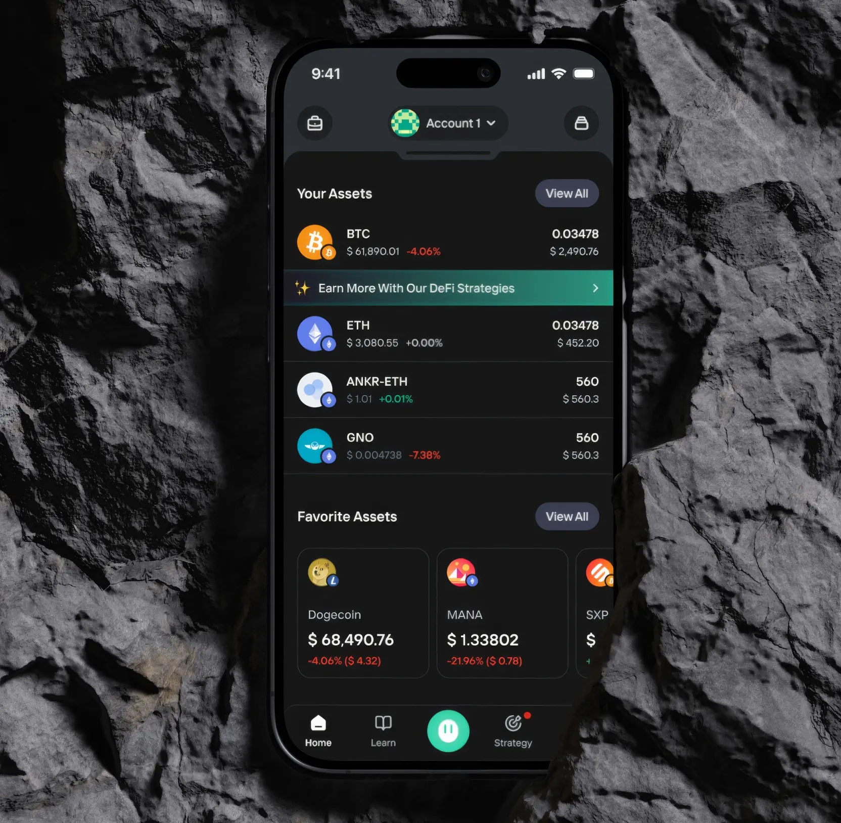
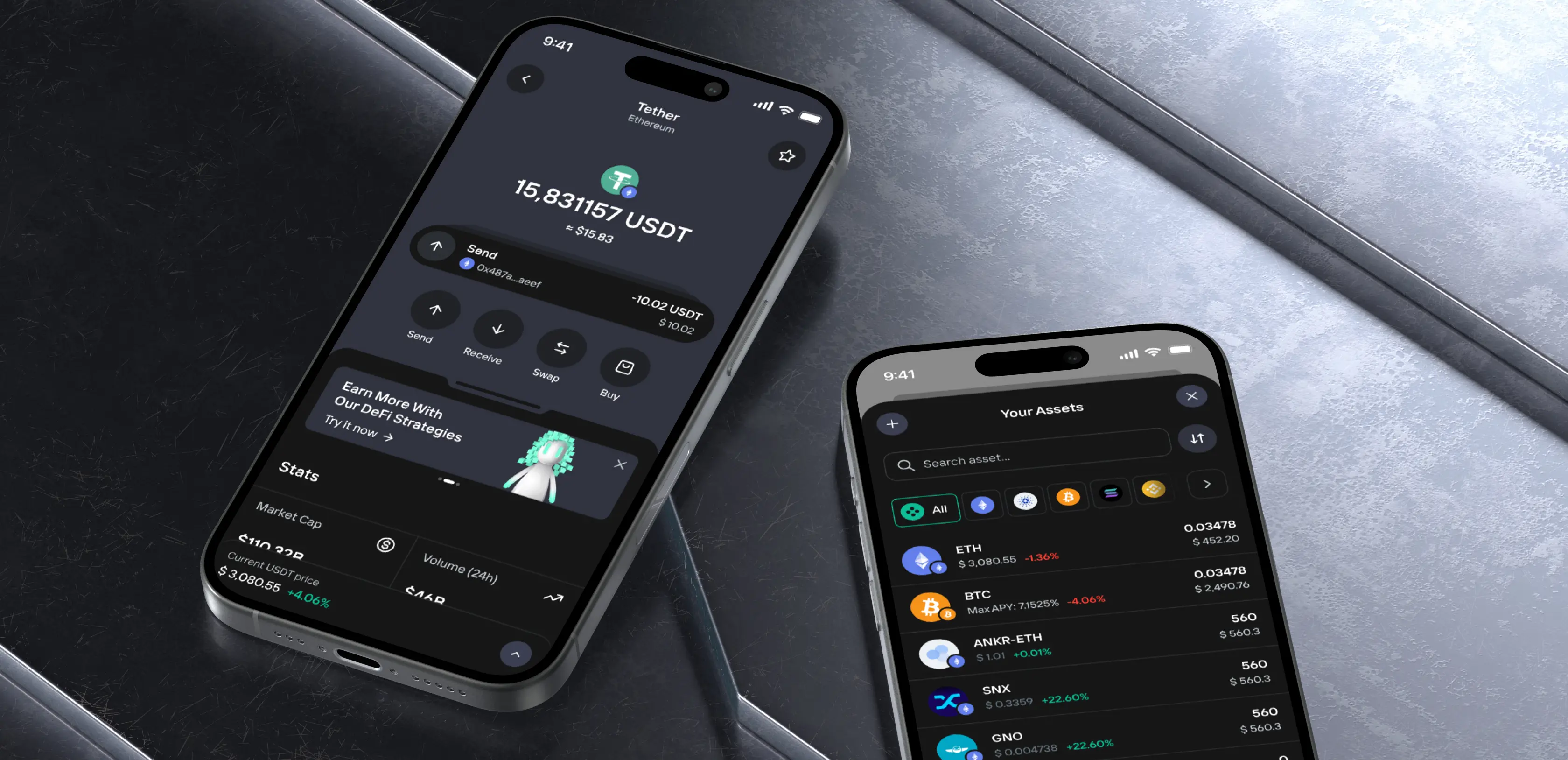
Turning Asset Pages Into Decision Tools
Most crypto apps show you a number and leave you to figure out what to do with it. We rebuilt the asset pages to surface everything that actually drives decisions: market trends, performance history, related strategies, and curated news relevant to each asset. Users stopped treating the app as a passive tracker and started returning to it before making moves. Daily active usage climbed as a result.
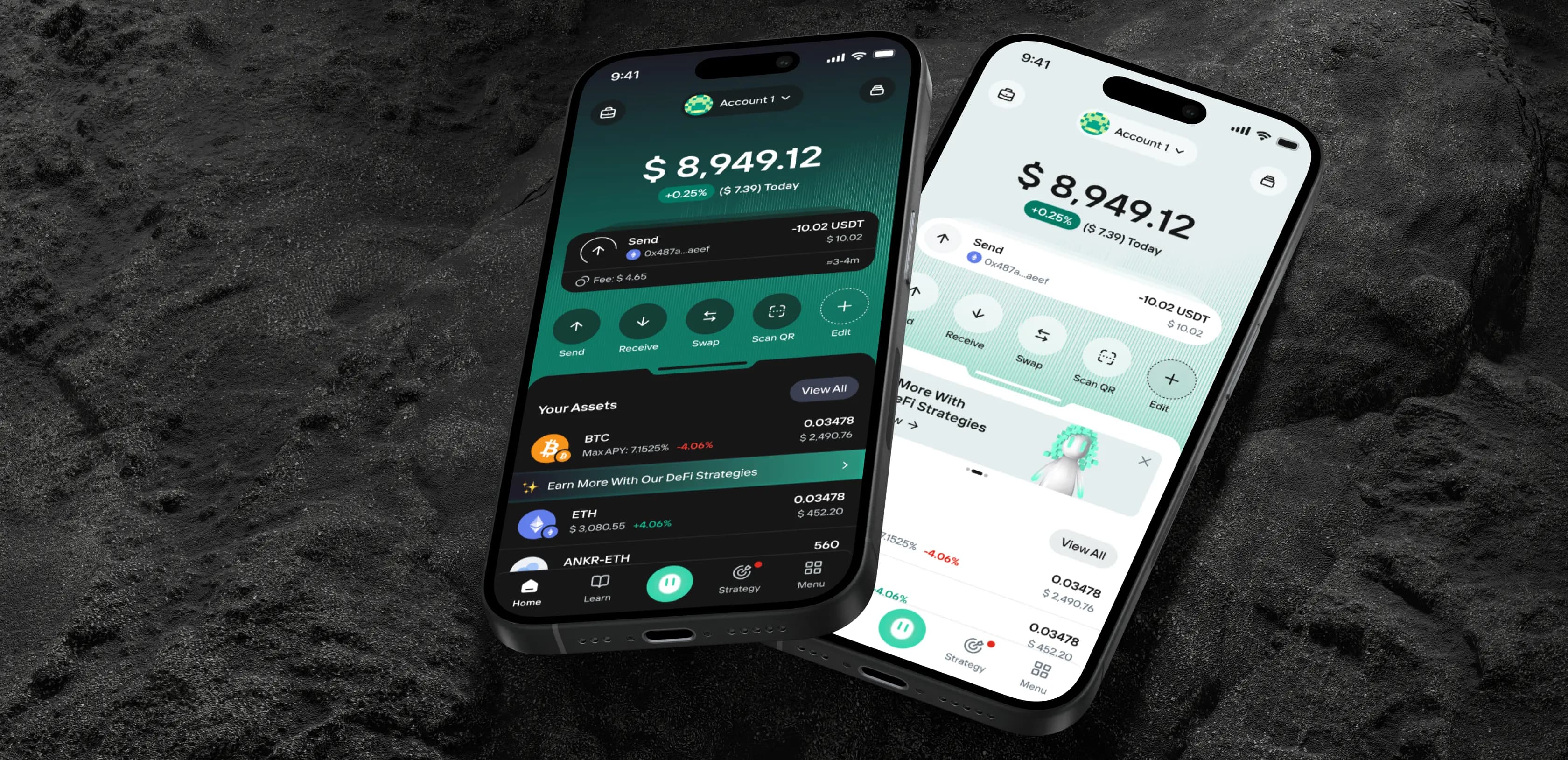
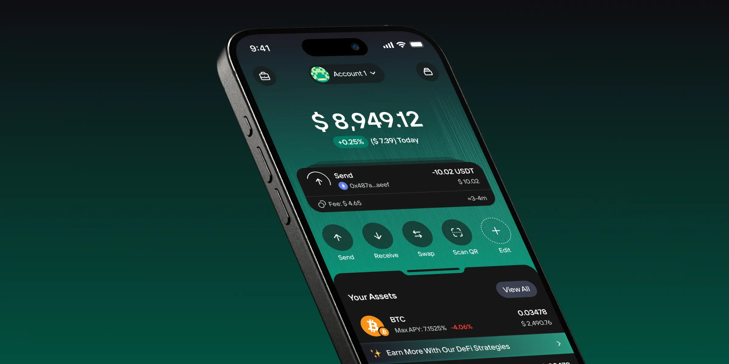
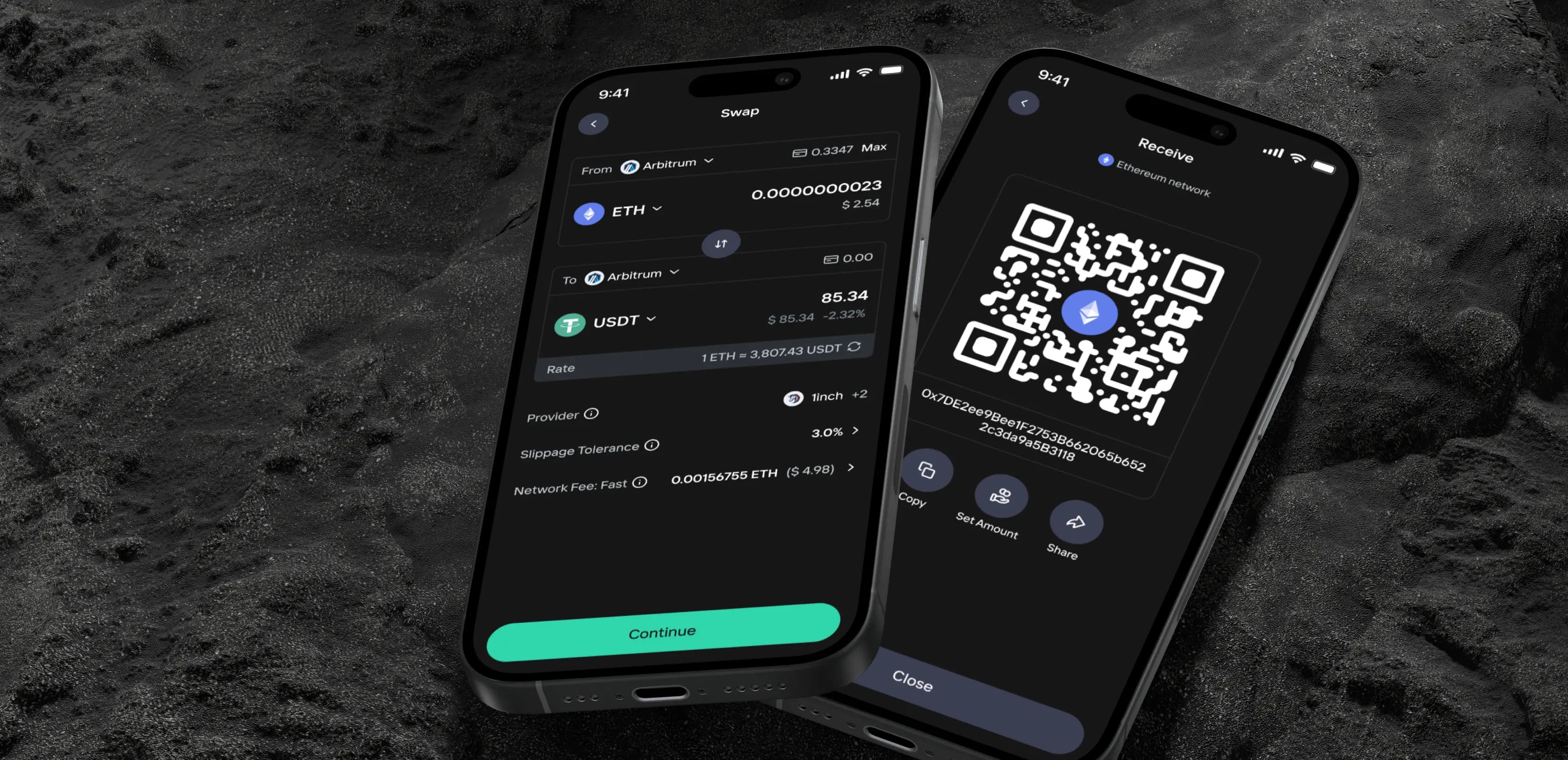
Simplifying Transfers Without Cutting Features
Sending crypto carries real anxiety for less experienced users, mostly because the flows are full of jargon and offer no reassurance mid-transaction. We rewrote the transfer experience in plain language, added persistent status widgets so users could see exactly where their transaction stood in real time, and removed every step that wasn't strictly necessary. Experienced users kept full control; newcomers stopped abandoning midway.
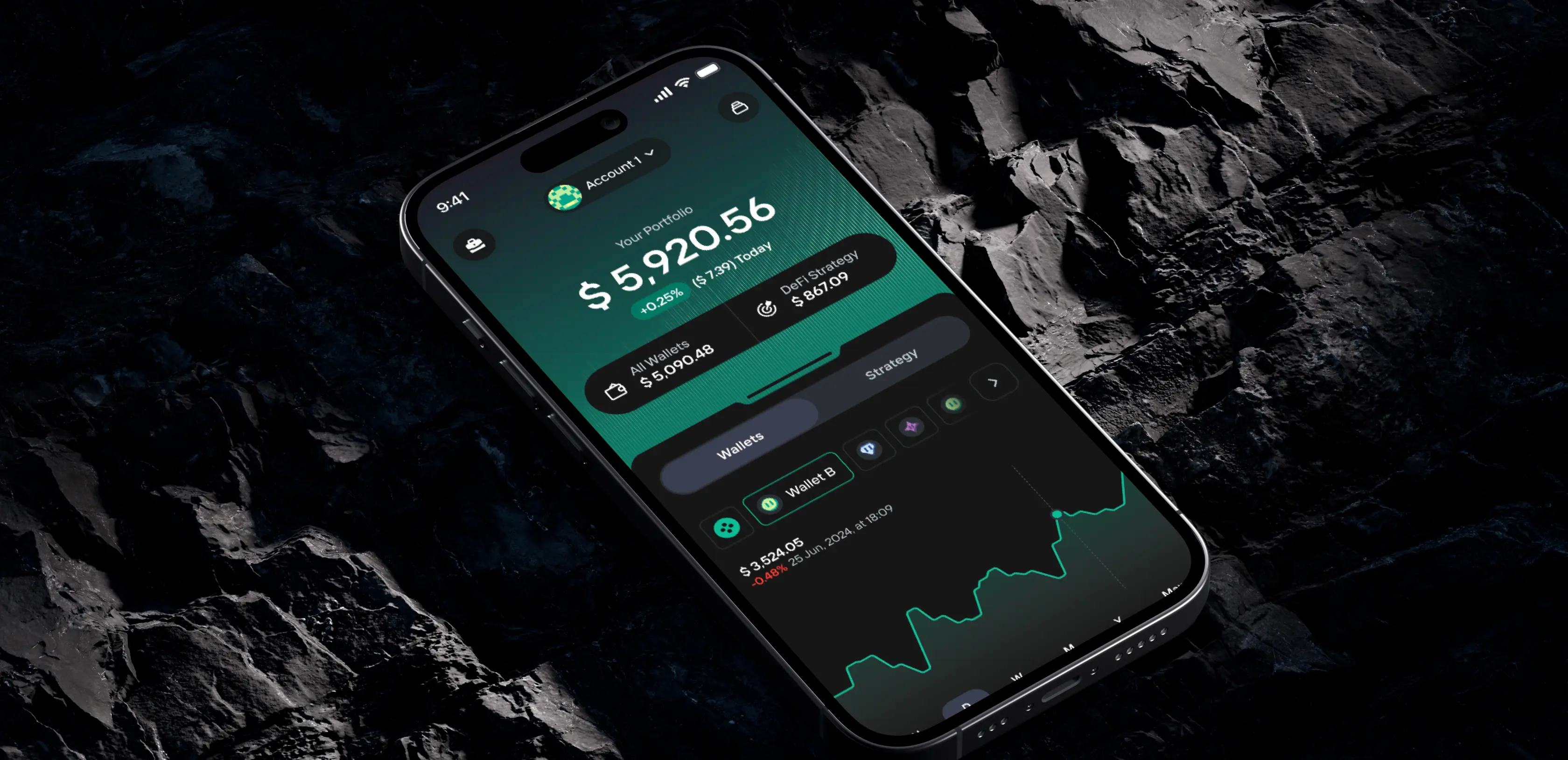
A Portfolio Layer for Power Users
Users managing multiple wallets had no way to get a consolidated view of their positions. We built a dedicated portfolio section that pulled together performance tracking, expense and profit breakdowns, and cross-account transfers into a single interface. It gave advanced users a reason to consolidate their activity inside the app rather than switching between tools, which in turn deepened engagement across the board.
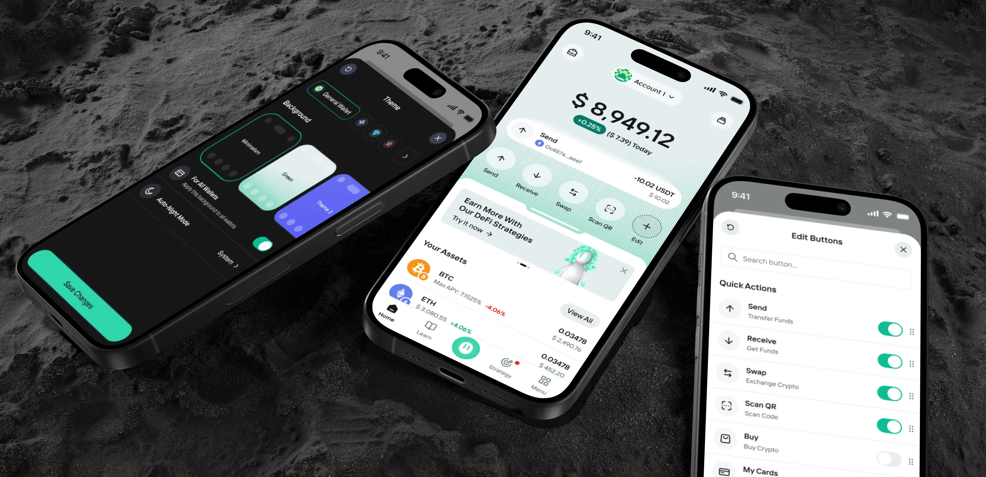
Personalization That Reflects How You Trade
Different users interact with crypto very differently. Day traders want one set of quick actions front and center; long-term holders want another. We built a customization layer that let users rearrange navigation, set display currency preferences, adjust quick actions, and choose themes. The result was an app that felt tailored regardless of how someone actually used it, which drove meaningful gains in session length.
Positioning the Brand for the Next Stage
The product improvements needed a brand that matched. We aligned the visual identity and communications with where the platform was heading rather than where it had been. The updated positioning made the app feel like a serious contender in the market, which mattered both for user confidence and for the partnerships conversations the team was having at the time.