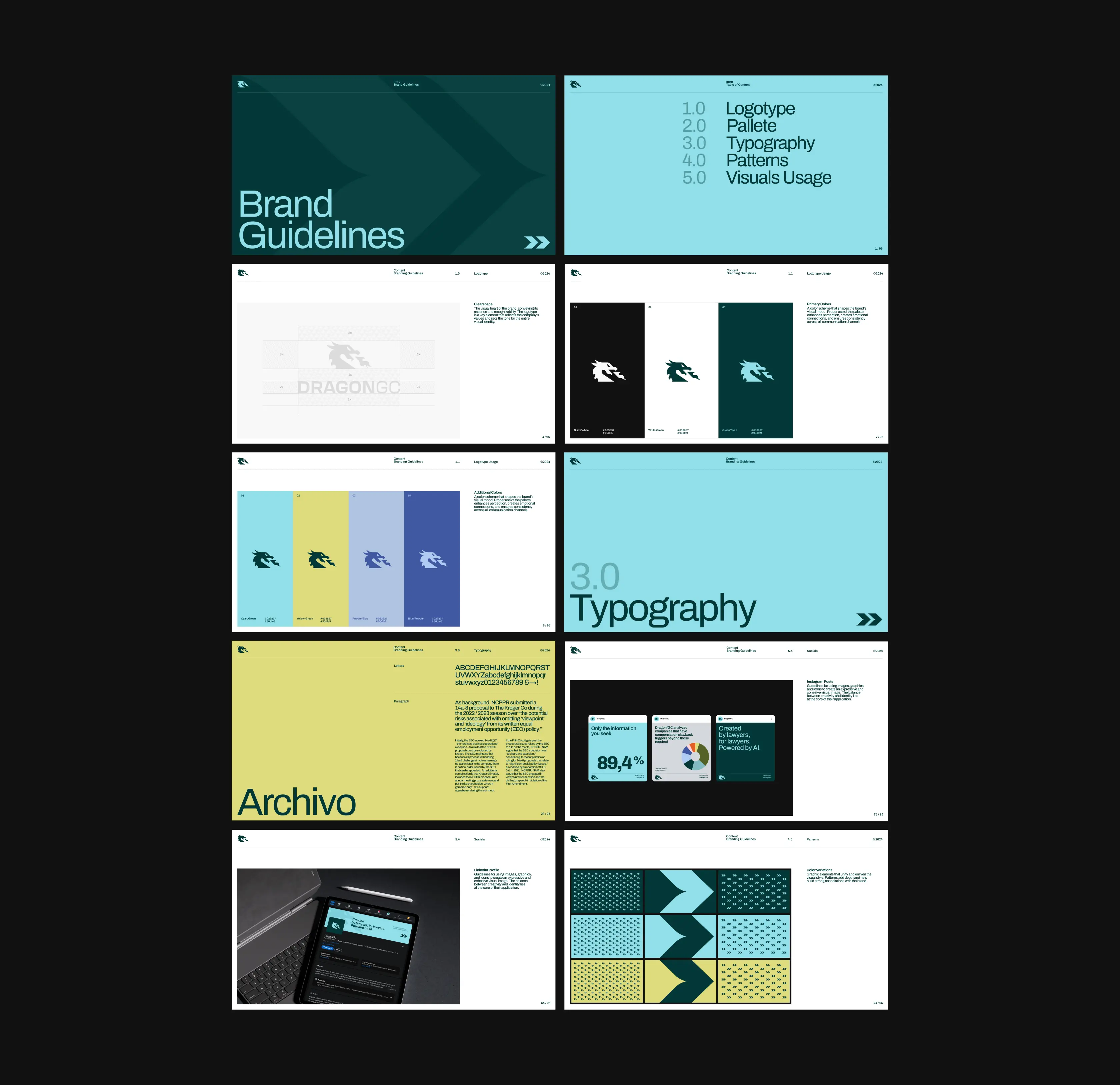
Building a brand that earns trust in every boardroom
DragonGC is a LegalTech AI platform built to help enterprises stay compliant and manage shareholder relations with precision. When they came to us, the business was ready to scale but the brand was not. An overly detailed logo, no shared visual language, and communications that looked different from one document to the next were quietly undermining their credibility with the very clients and investors they were trying to win. We took on the full brand overhaul: logo, color system, pattern library, and a communication framework to hold it all together.
Four pillars that shaped the new identity
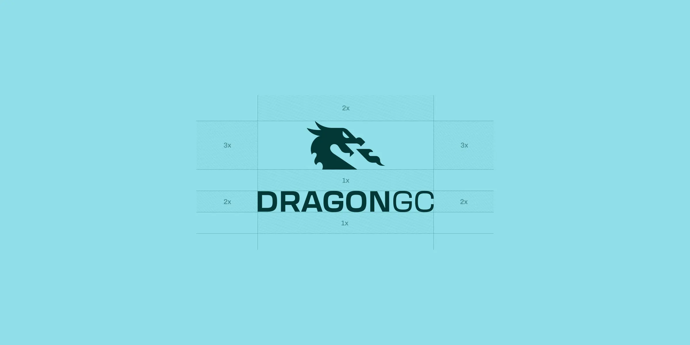
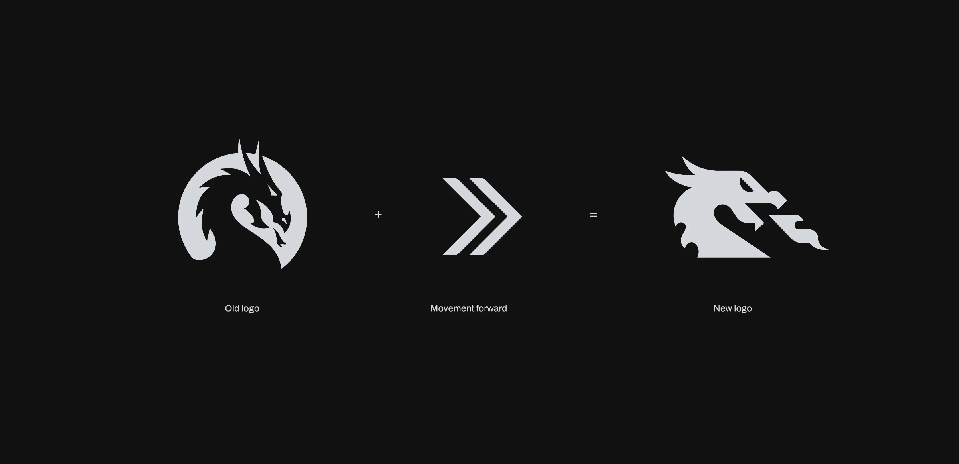
Redesigning the Logo for Authority
The existing logo had too much going on. Intricate details muddied the message at smaller sizes and undercut the premium feel the brand needed. We stripped it back to its core, sharpened the dragon silhouette, and reoriented its gaze forward. The result is a mark that reads clearly at any scale and projects exactly the kind of strategic confidence a LegalTech company should own.
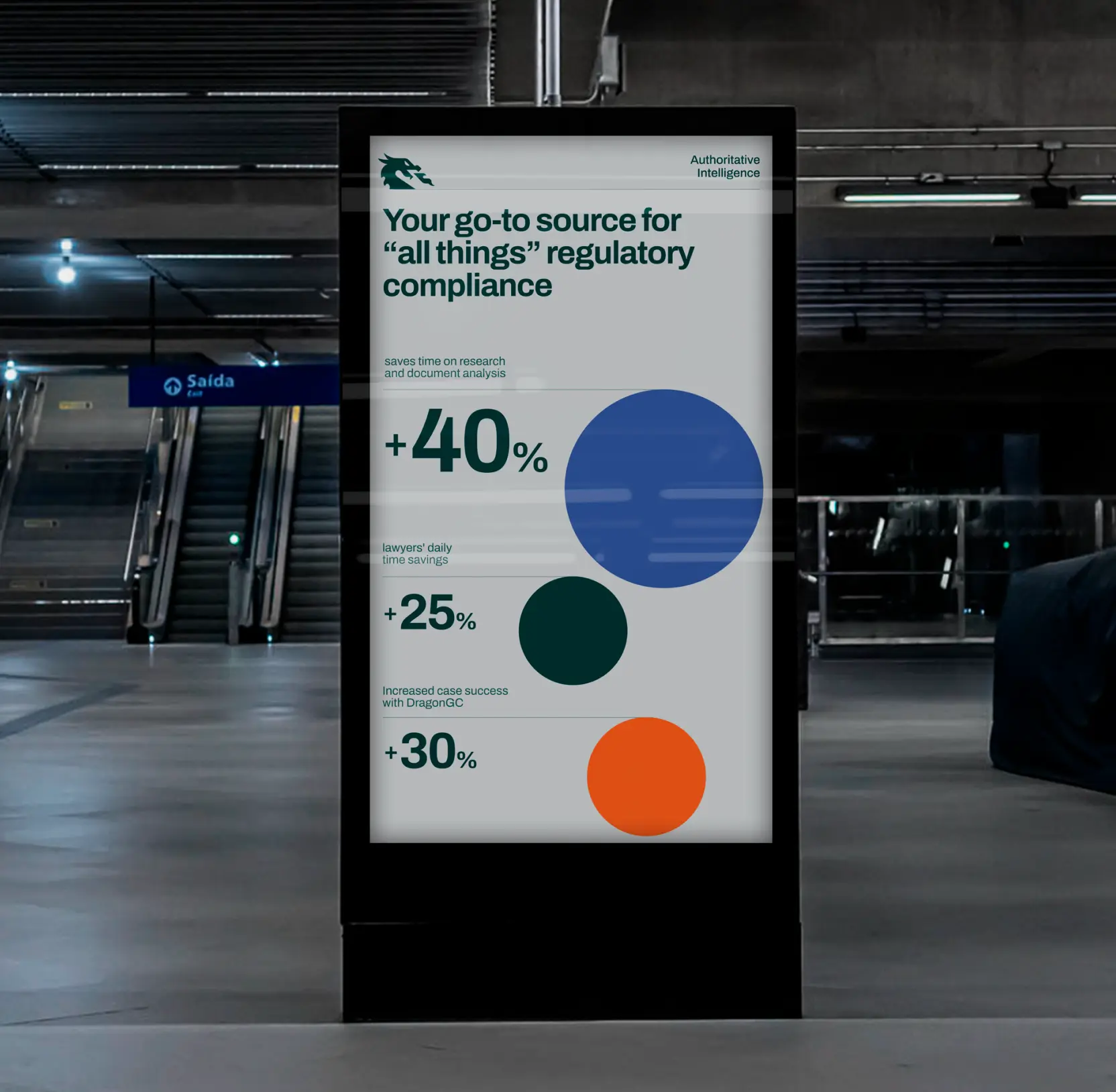
Building a Color System Around Data
DragonGC's core product is data: compliance dashboards, shareholder reports, analytical outputs. We built their palette with that in mind. The expanded color set was designed to make charts and data visualizations immediately legible while still feeling unmistakably on-brand. Every shade has a job, whether that's anchoring a headline, mapping a data series, or holding space in a dense investor deck.
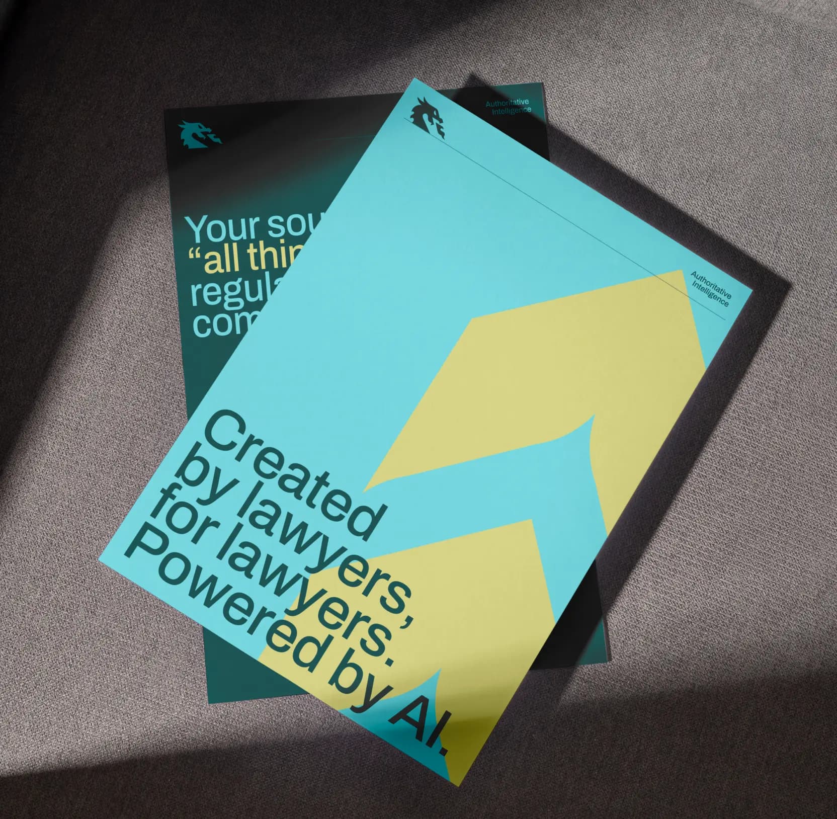
Turning the Logo Into a Living Pattern
We extracted the logo's geometry, the dragon form and its directional lines, and turned it into a modular pattern system. These elements tile into rhythmic grids and dynamic compositions that can be dialed up for bold background treatments or pulled back for subtle texture. The same shapes that define the mark now define the brand's entire visual environment.
Unifying Every Brand Touchpoint
We closed the loop with a full communication ecosystem: presentation templates, social media frameworks, print materials, and a tone-of-voice guide that aligns how DragonGC writes with how it looks. Everything was consolidated into a brand book, giving the internal team a single source of truth they can hand to any partner, designer, or agency and get consistent results without a briefing call.