Redesigning a Web3 platform that users actually want to come back to
Kin is a Web3 ecosystem built around a cryptocurrency designed for everyday use in digital apps and services. After five years in operation, the platform had grown in scope but not in clarity. Fragmented content, a developer portal that discouraged adoption, and a user journey full of unnecessary friction were quietly limiting growth. Kin brought us in to do a full platform redesign: rethink the structure, rebuild the developer experience, and create a design system that could scale with the product. The results came through fast.
Five areas that drove the turnaround
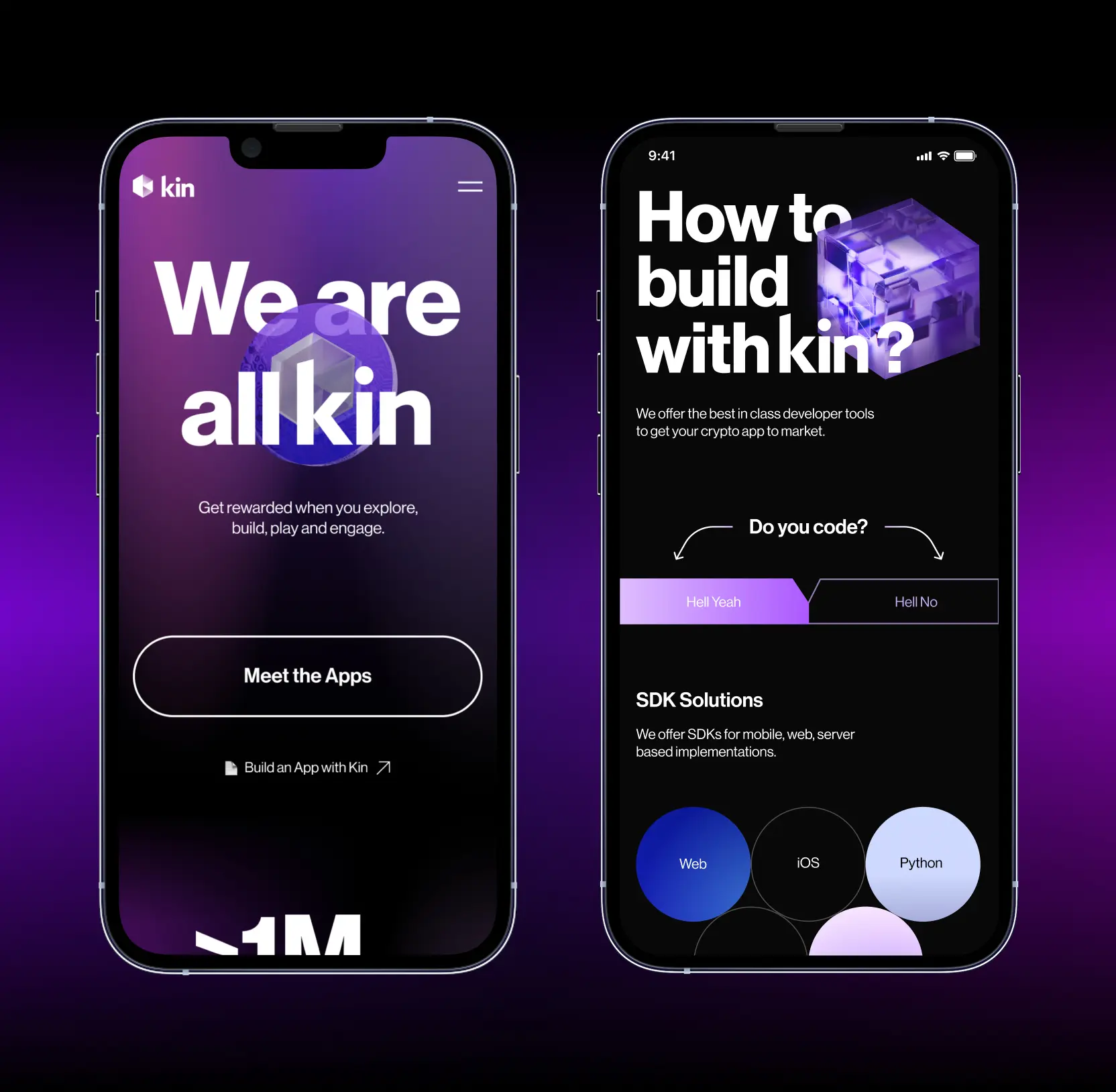
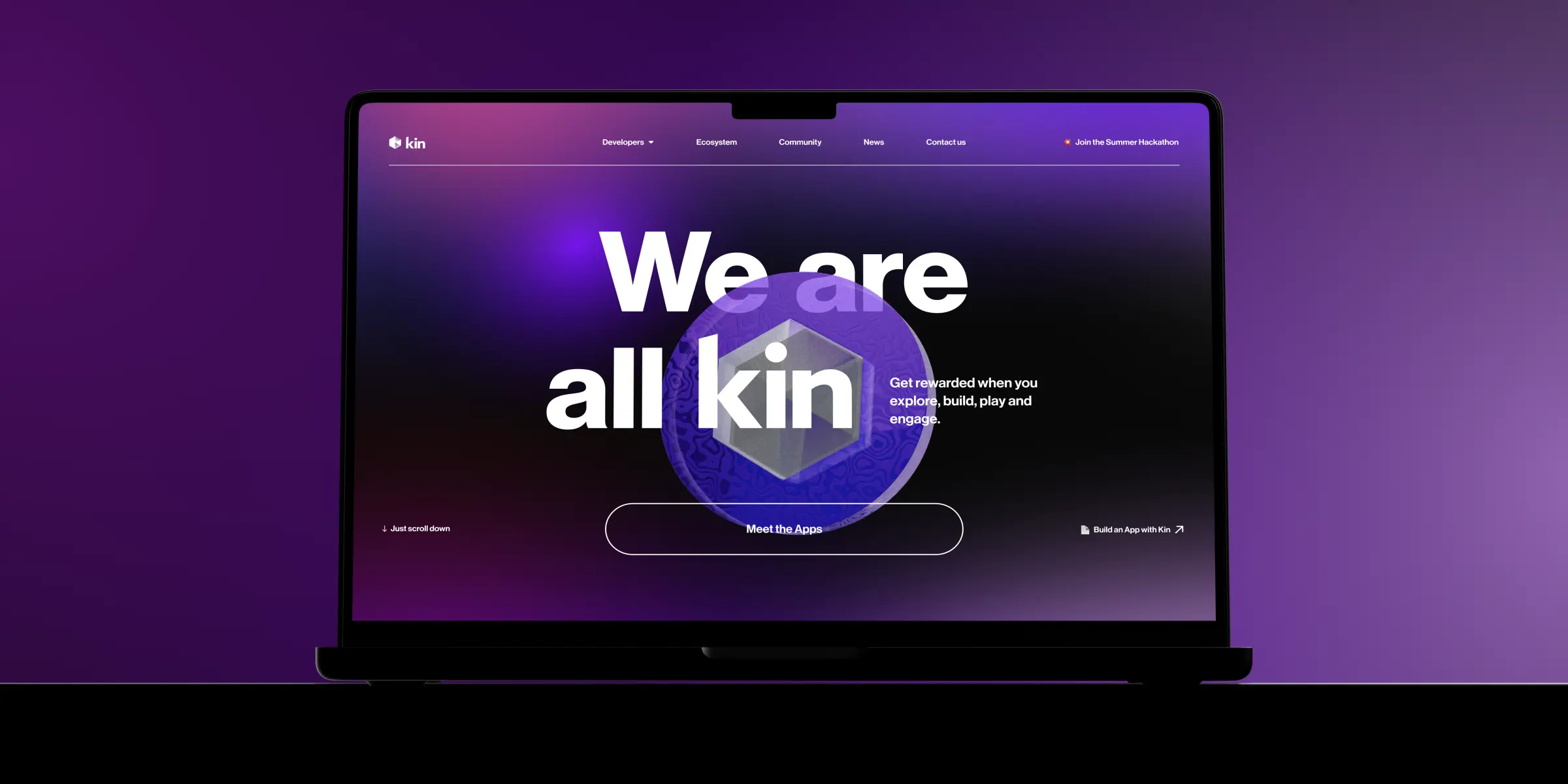
Rebuilding the Core User Experience
Kin's five-year-old platform had accumulated a lot of friction. Navigation was inconsistent, content was buried, and users routinely dropped off before finding what they came for. We audited the full user journey and restructured the information architecture from scratch. Every page was rebuilt around a clear purpose, with navigation that actually reflects how users think rather than how the platform was historically organized.

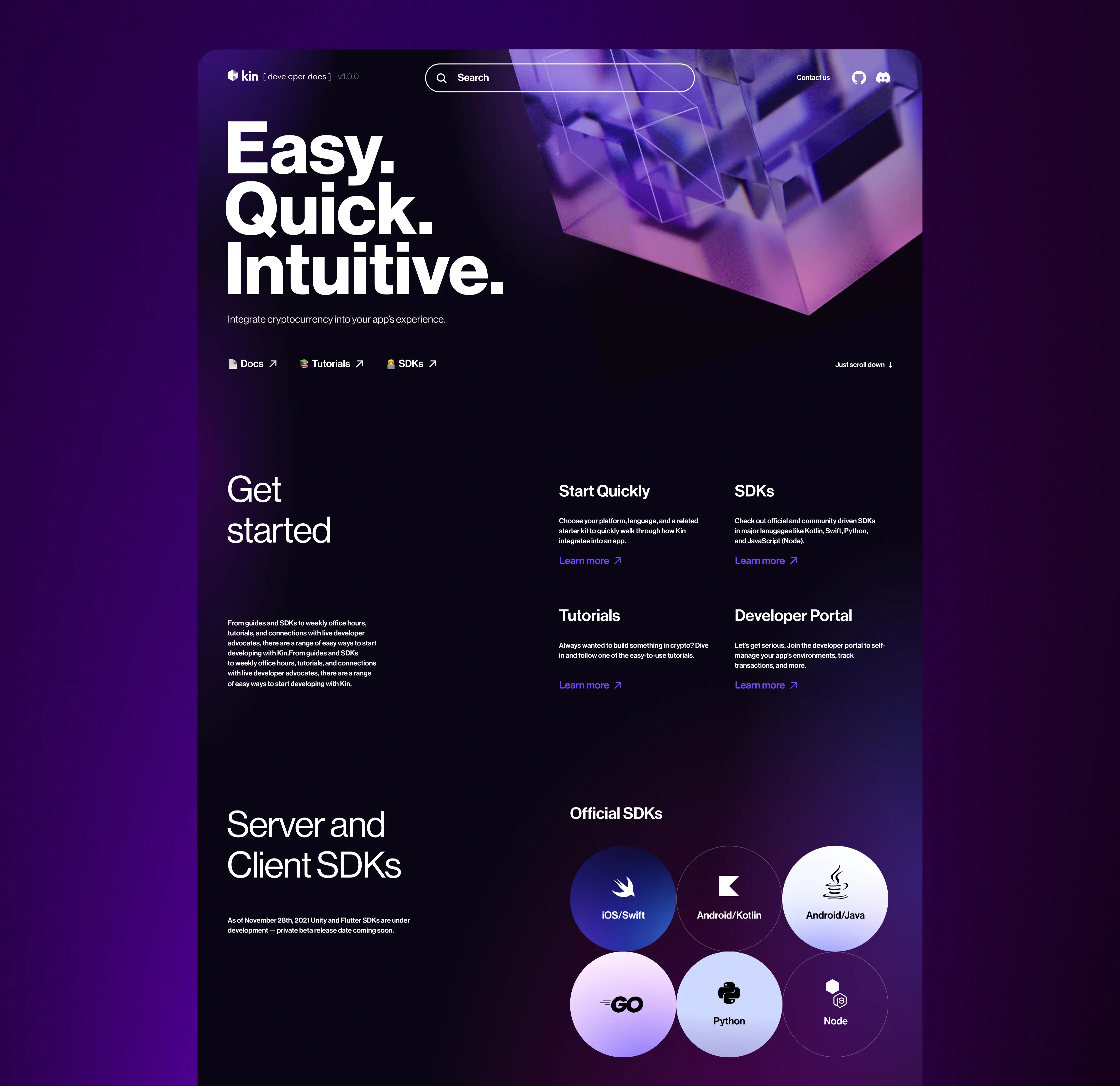
Rebuilding the Developer Portal
Developers are one of the most valuable user groups in any Web3 ecosystem, and they have zero patience for poor documentation or confusing onboarding. We redesigned the developer portal from the ground up: cleaner API references, a structured getting-started flow, and a layout that gets developers to their first integration faster. The result was a meaningful jump in developer adoption and more than 20 new platform integrations within months of launch.
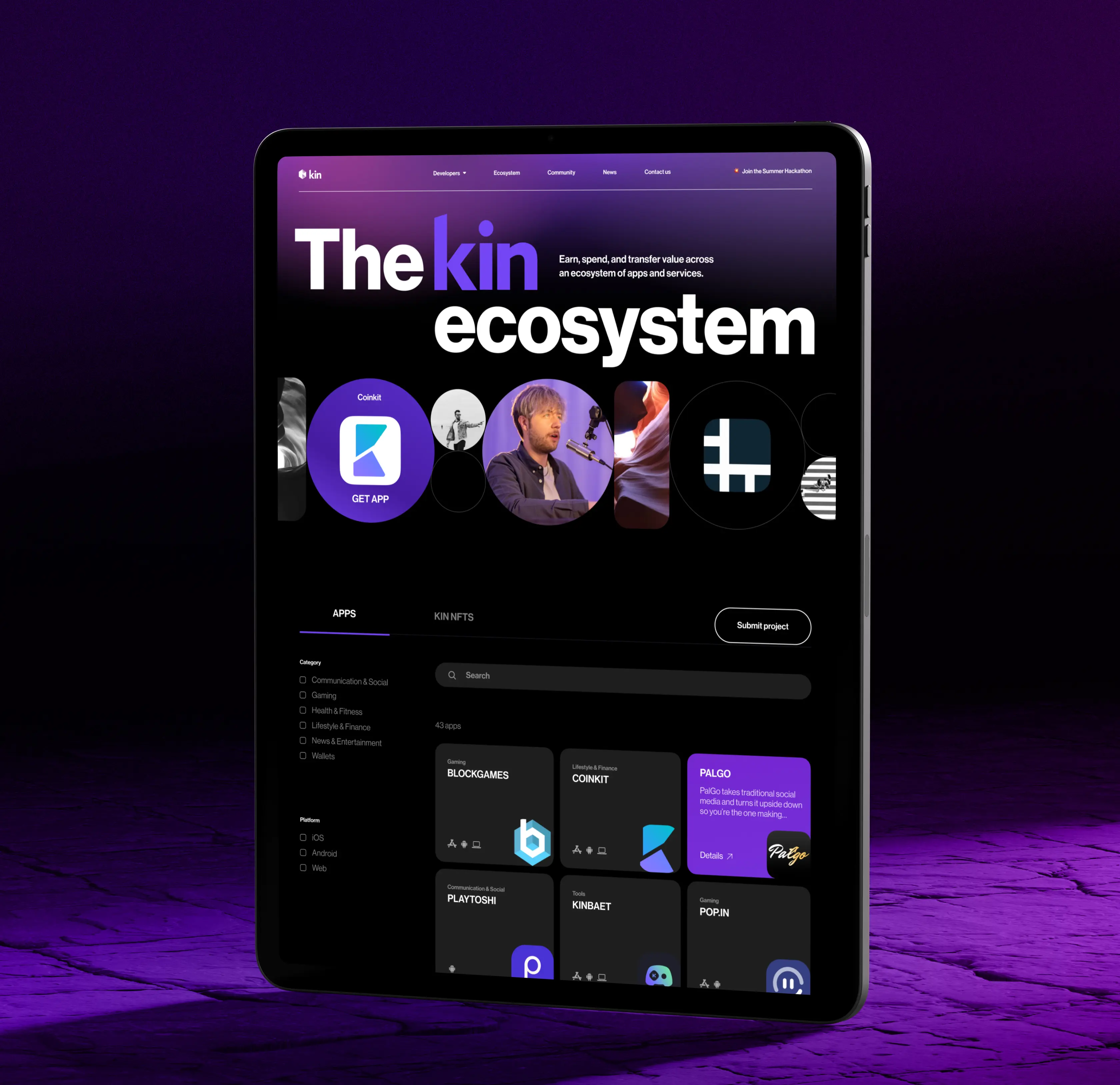
Making the Rewards Ecosystem Discoverable
Kin Rewards existed before the redesign but most users never found it. The feature was buried in a navigation structure that prioritized internal logic over user intent. We gave it proper placement, clear explanatory copy, and entry points at the moments users were most likely to engage. Surfacing it properly changed how users experienced the platform and contributed directly to the retention lift we saw post-launch.
Designing for Every Screen
A platform serving both general users and developers gets accessed in wildly different contexts. We built the design system to perform consistently across desktop, tablet, and mobile without resorting to watered-down mobile versions. The same hierarchy, the same readability, and the same core interactions carry through regardless of screen size. This was especially important for the developer-facing sections, where desktop usage dominates but mobile needed to hold up.
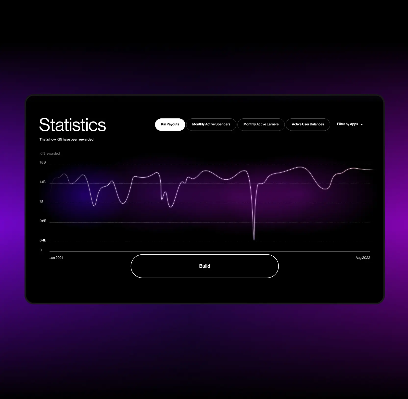
Streamlining Onboarding and Ecosystem Access
Getting a new user from sign-up to active participation is where most platforms lose people. We mapped the onboarding sequence step by step, identified where users were stalling, and redesigned the flow to reduce decisions and remove ambiguity. Clearer prompts, better contextual guidance, and a tighter connection between onboarding steps and actual platform features brought the drop-off rate down significantly and gave the retention numbers a lasting boost.