Turning a legacy financial tool into a platform investors actually want to use
A financial calculator for vessel investment had been running for years with the same interface it launched with. The underlying model was sophisticated, able to account for compound interest, loan structures, inflation, yard efficiencies, and technological improvements across a vessel's lifespan. But the platform was fighting its own users. Navigation was inconsistent, the interface hadn't kept pace with enterprise expectations, and the data outputs were hard to interpret without significant expertise. We came in to modernize the whole thing, add new functionality, and make the tool worthy of the decisions it was informing.
Six layers that rebuilt the experience
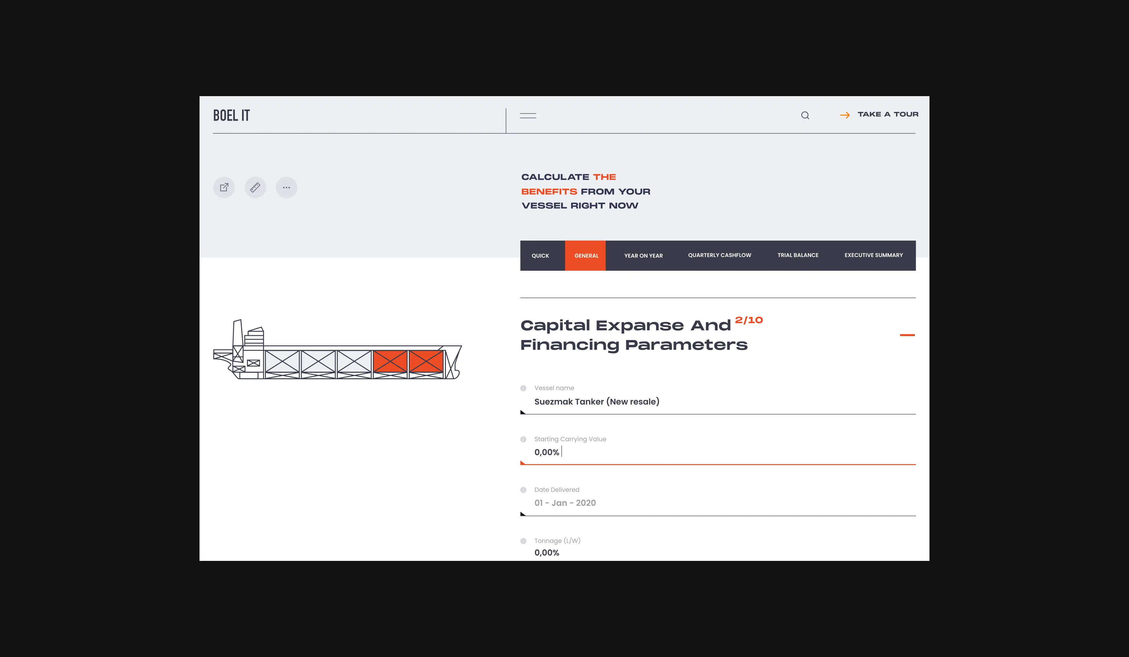
Making Sense of Complex Financial Data
The platform ran compound interest calculations accounting for loan structures, equity advances, inflation, yard efficiencies, and technological improvements. It was powerful and completely impenetrable to most users. We started by mapping what investors actually needed to understand from the output and restructured the entire experience around clarity. Every screen was rebuilt to surface the insight rather than the calculation, so users could understand what the numbers meant without needing a spreadsheet background.
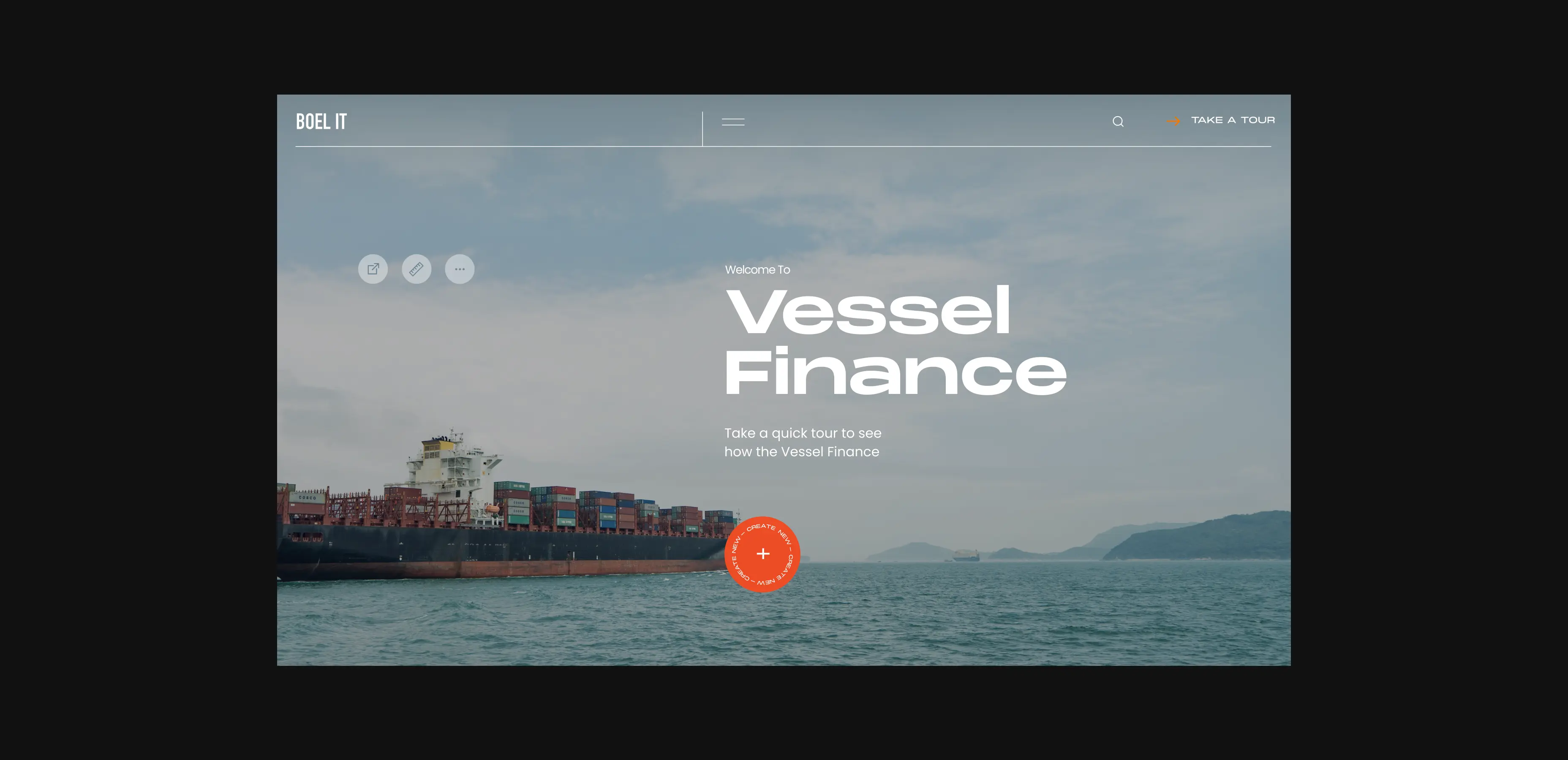
An Interactive Ship Selection Experience
The entry point to the platform was a static form. We replaced it with an interactive homepage where investors select vessel types through a visual gallery with full descriptions, photography, and context. The change was deliberate: putting the ships front and center connected the financial tool to the physical reality of what was being assessed. It grounded the experience and made the platform feel like a serious investment tool rather than a legacy calculator.
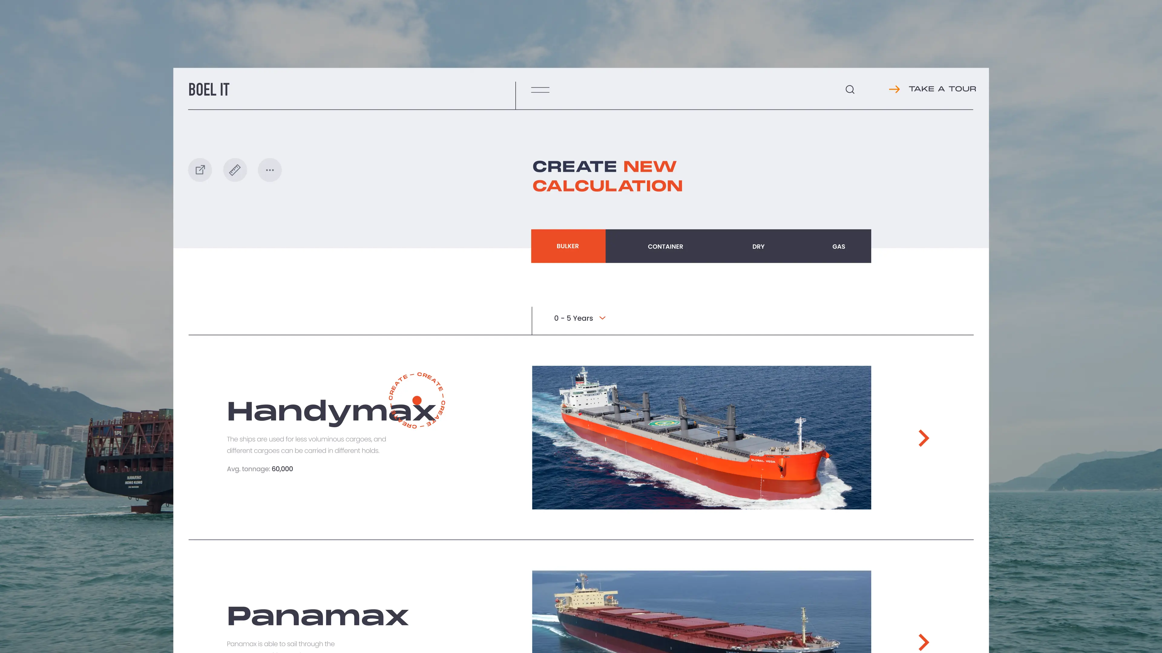
Visual Comparison That Speeds Up Decisions
Evaluating multiple vessel options side by side was cumbersome before. We introduced an interactive swipe-based comparison feature with visual representations and color-coded accents that made differences immediately legible. Investors could move through options quickly without losing context, which shortened the evaluation phase and reduced the back-and-forth with analysts that the old platform required.
A Cash Flow View That Responds to Your Inputs
One of the most powerful moments in the redesigned platform is the cash flow screen. As users adjust financial parameters, a vessel visualization fills dynamically in response. It's the kind of feedback that turns an abstract spreadsheet exercise into something tangible. Users immediately see how their choices affect the outcome, which builds confidence and makes the tool feel responsive rather than passive.
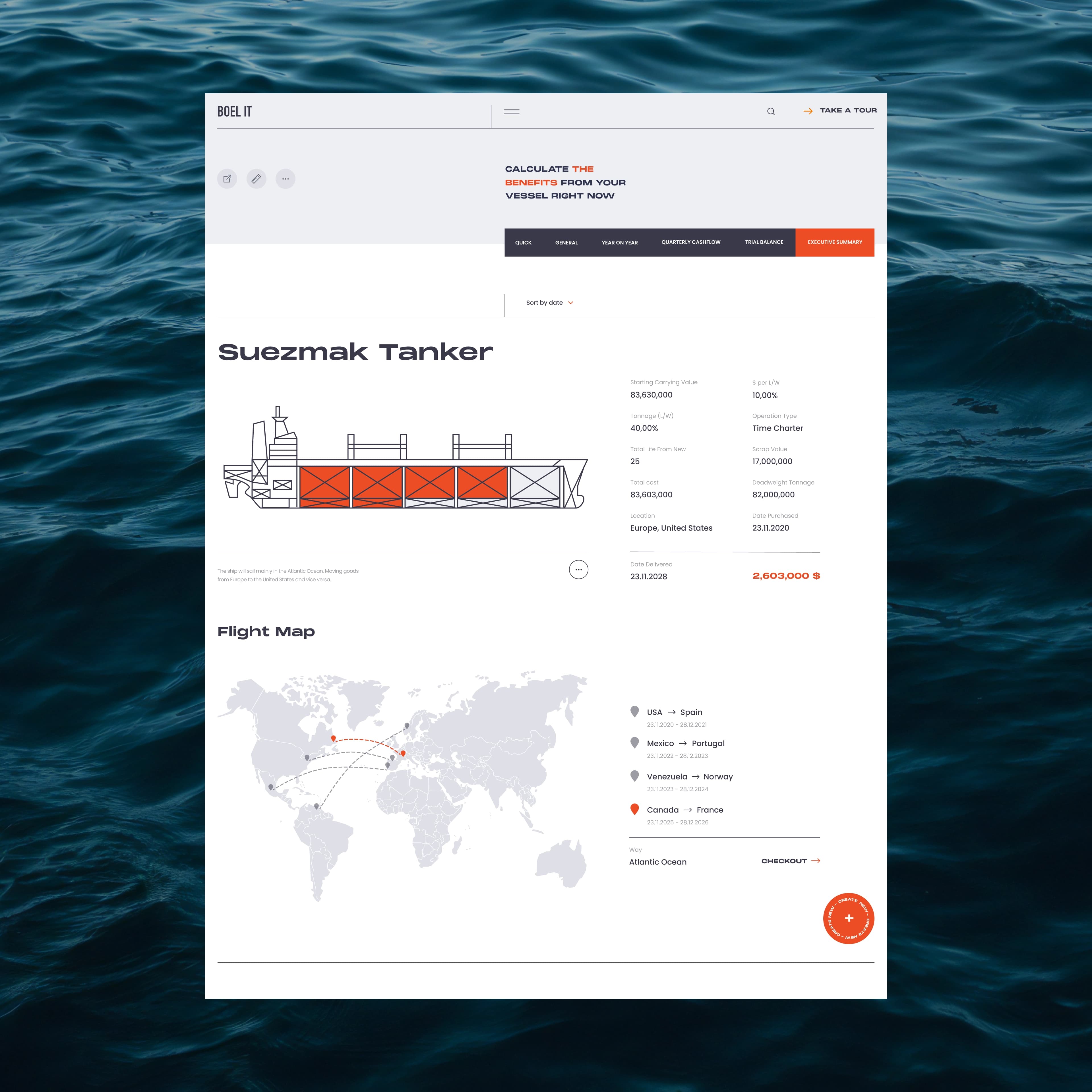
An Executive Summary That Tells the Story
The final output needed to work for two audiences: the analysts who built the model and the executives who would act on it. We designed an executive summary section where an interactive ship element served as the visual anchor for the financial data. Complex outputs were organized into scannable sections that communicated the headline findings first and the supporting detail second. Decision-makers got what they needed without having to dig.
Full Functionality on Every Device
Enterprise tools often treat mobile as a secondary concern. We didn't. The mobile interface was designed to carry the full decision-making workflow, with navigation patterns that felt familiar from the desktop but were rebuilt for touch. Investors could review vessel assessments, compare options, and pull up executive summaries from anywhere. The platform stopped being something you needed to be at a desk to use.